Stay Finder
Testing
User Interface
Prototyping
Stay Finder a Holiday Finding App
Project Overview
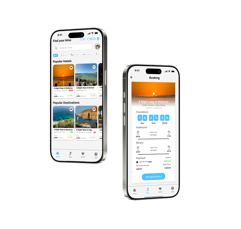
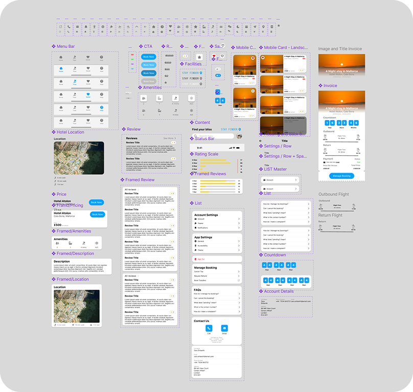
Stay Finder is a concept travel app designed as a UI-focused exploration. The goal was to create a visually polished interface that demonstrates my design style and ability to craft clean, modern, and engaging screens. Unlike my other projects, this piece was not driven by a research brief or problem statement, but instead by the creative challenge of building an elegant and cohesive visual identity for a travel app.
Stay Finder
Stay Finder makes travel planning simple. Whether you’re searching for a quick weekend escape or a long holiday getaway, our app helps you discover the best stays and book them with ease. Browse hotels, apartments, and unique stays worldwide and secure your trip in just a few taps.
App Icon
The Stay Finder app icon features a location pin set against a background, symbolising the core functionality of the app, helping users discover and navigate to their ideal stays.

The pin instantly communicates travel and exploration, while the clean background ensures clarity and recognisability at a glance, making the icon both visually appealing and immediately meaningful in the context of travel planning.
Styles
iOS apps must support multiple system appearance modes, including Light, Dark, and Accent-tinted modes, to ensure consistent functionality and visual experience.
Sizes
For iOS, app icons must be provided in multiple sizes to suit different devices and contexts. From the home screen to Spotlight search and system settings. I created a consistent icon design that scales effectively across these variations while maintaining brand recognition.
UI Screens
The core focus of this project was to create visually striking UI screens. I worked to get consistent typography, colour and clear spacing to highlight usability and hierarchy, while maintaining aesthetic appeal. These hero screens showcase the visual identity of Stay Finder in action across different user flows.
Visual Language
The Stay Finder interface was designed with a minimal and modern aesthetic, keeping the experience clean and uncluttered. Information is presented through card-based layouts, which provide a clear visual hierarchy and help group related details in a way that’s easy to scan.
Consistency
Consistency was a key focus throughout the design. I built the screens using Figma components, shared styles, and predefined colour palettes to ensure a cohesive look and to speed up the design process. This approach meant that buttons, icons, and typography maintained uniformity across the app, strengthening the overall brand identity.
Styles
The colour palette is simple and functional, with subtle use of blue accents to highlight interactive elements and guide the user’s attention. Paired with a clean sans-serif typeface and ample white space, the result is an interface that feels approachable, highly legible, and focused on usability.
Next Project